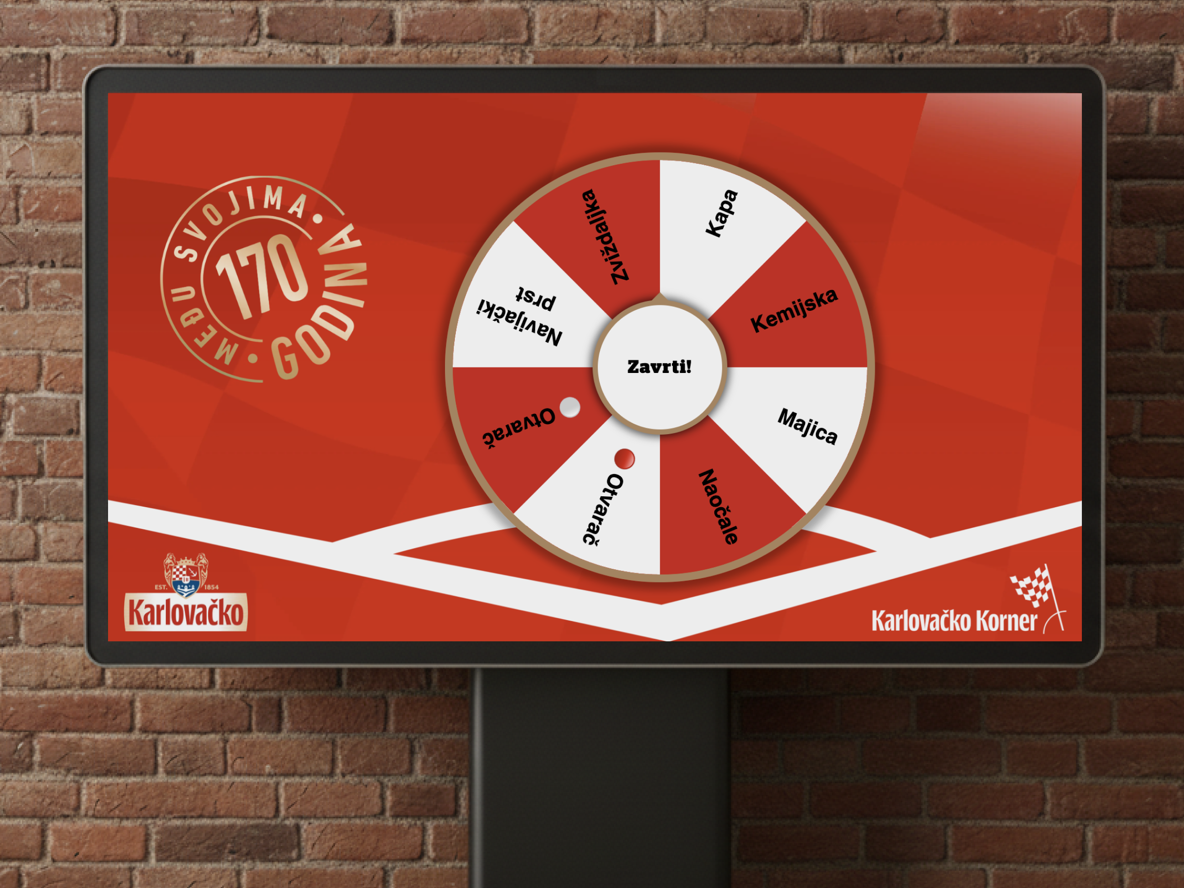
Karlovačko KVARTovačko - Visual Preparation for 127 Locations
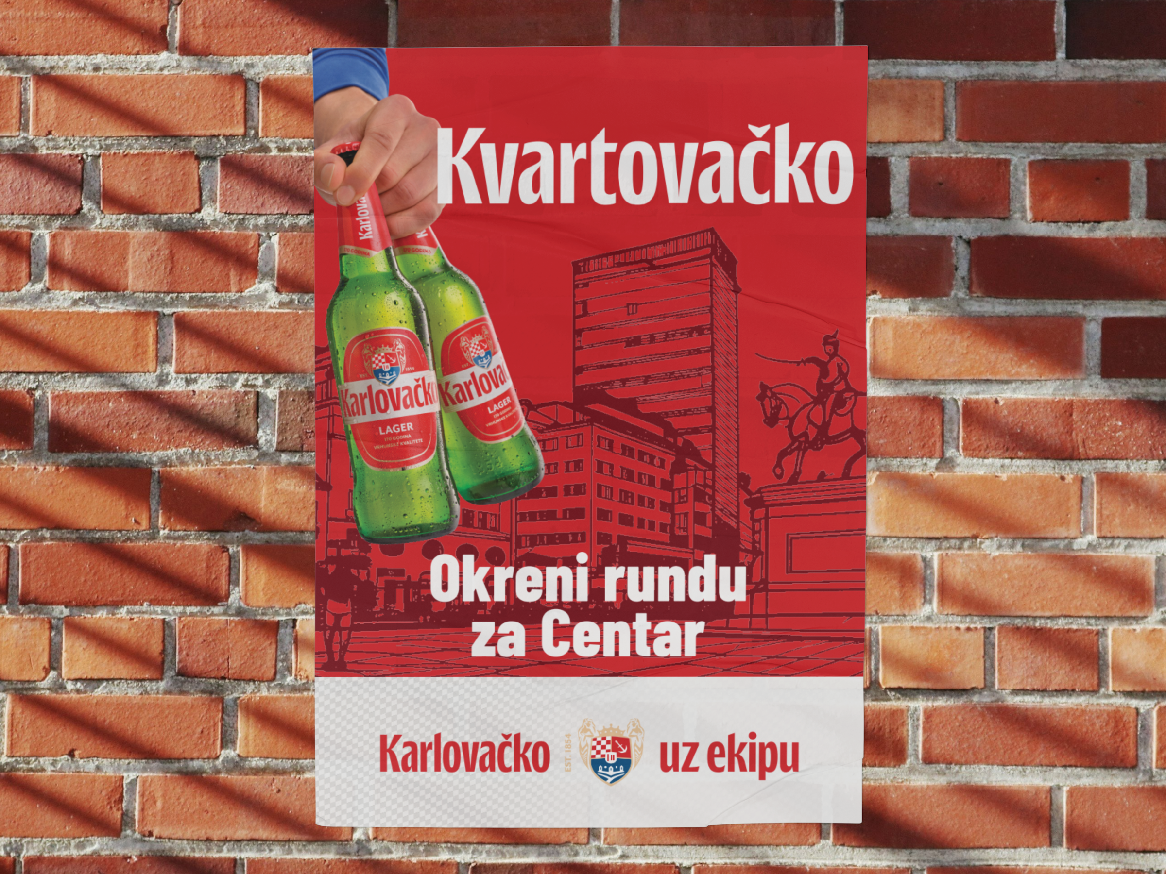
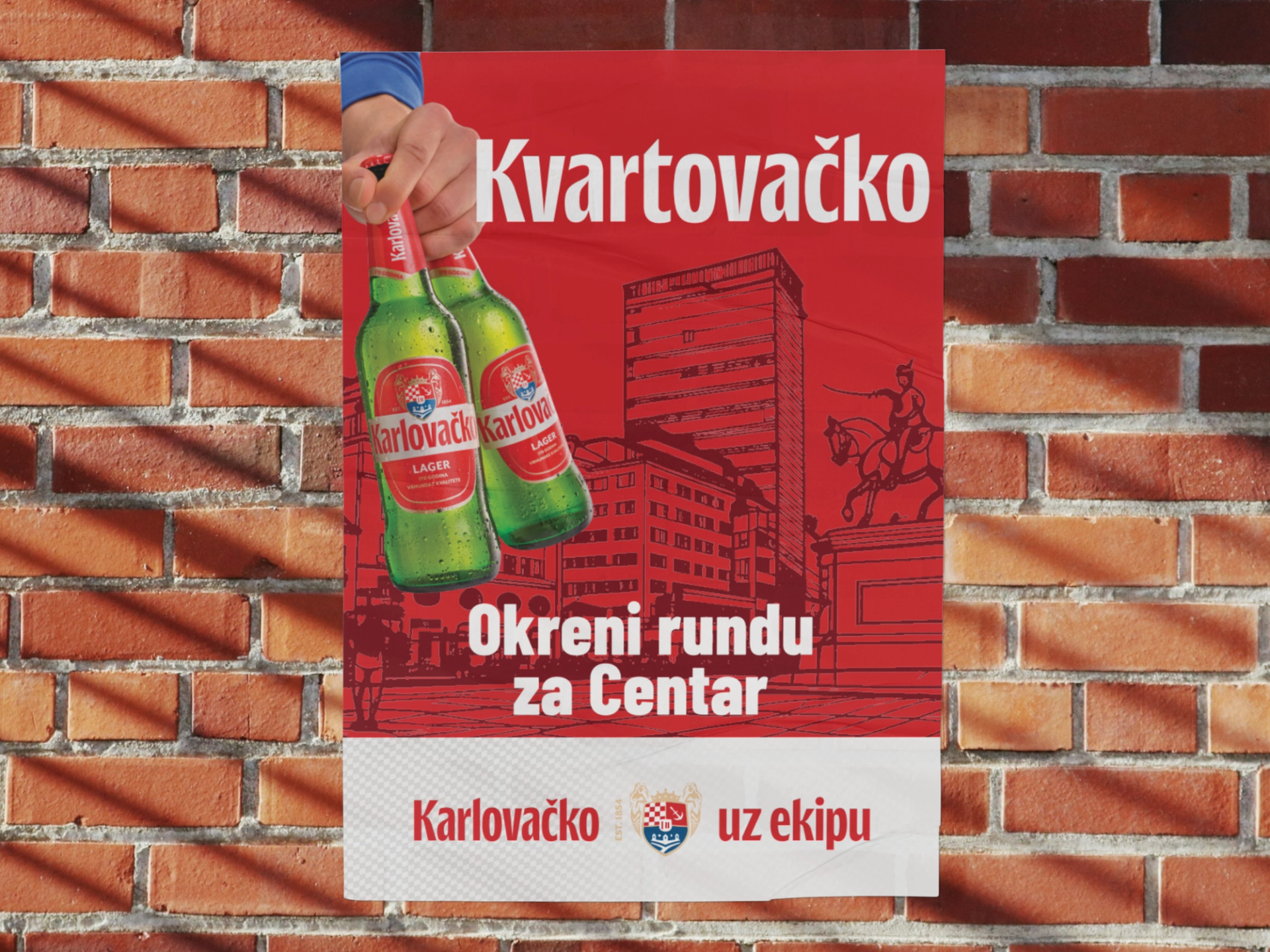
As part of the national KVARTovačko campaign, we worked on preparing visuals and posters for Karlovačko beer. The campaign covered 127 cities and municipalities across Croatia, which made the project demanding from a production perspective. Our task was to adapt visuals in different formats and ensure brand consistency across a large number of local variations.
In campaigns of this scale, precision, organization, and quality control are essential. One idea has to be translated into many materials, and each of them must look like part of the same campaign. At the same time, local names, formats, and print preparation have to be accurate because small mistakes become significant when multiplied across hundreds of executions.
Project Goal
The goal was to prepare visuals that keep the recognizable Karlovačko identity while adapting to local names and different production requirements. The materials had to be ready for print and campaign use without weakening visual consistency. The focus was reliable execution, not unnecessary changes to the creative direction.
- Prepare visuals for 127 cities and municipalities.
- Maintain a consistent look for the Karlovačko campaign.
- Ensure technically correct files for print and production.
What We Built
We worked on adapting posters and visuals in multiple formats, paying attention to typography, composition, local names, and final production requirements. Each variation needed to be checked to ensure elements were positioned correctly and materials were ready for further use. In this type of work, a good process is just as important as the design execution itself.
- Adaptation of visuals for many local variations.
- Control of typography, names, and composition.
- Creation of materials in different formats.
- Preparation of files for print and production.
User Experience
The audience sees the finished poster in their city or neighborhood, but behind it is a large number of precise decisions. A localized visual has to feel natural, as if it was created for that location from the beginning. That is why every execution had to keep the campaign energy while making the local element clear and properly integrated.
Challenge and Approach
The biggest challenge was volume. With 127 locations, working quickly is not enough; the work has to be systematic. Every name, format, and element must be checked because mistakes can easily repeat across a series. We organized the process to maintain consistency while allowing efficient preparation of a large number of materials.
Result
Karlovačko received a large set of localized visuals ready for the campaign. The materials kept the recognizable brand look while supporting the local character of the KVARTovačko concept. The project showed the importance of reliable production execution in campaigns with many variations and a high risk of small errors.
- Materials were prepared for 127 locations.
- The campaign kept visual consistency across all variations.
- Final files were organized and ready for production.
Additional Value
The additional value of the project was that campaign localization could remain clean and controlled despite the large number of executions. Each city or municipality received its own material without losing the shared campaign identity. This matters for brands that want to feel locally relevant while remaining recognizable.
What This Project Shows
This project shows that design is not only a creative idea, but also precise execution. When a campaign has many local adaptations, the value lies in a systematic process, detail checking, and the ability to keep the same quality standard across every variation.